3. Dashboard View
The Dashboard view is the primary visualization of your finances. Here a visual summary of all financial information is presented in a customizable way. This view is always accessible by selecting its tab at the top of the application.
In order to better understand how the dashboard functions, please note the following terms.
- Dashboard
A visualization of financial information composed of multiple dashboard pages each with a customizable layout of dashboard items (also called widgets). The entire view is called the dashboard.
- Dashboard Page
A named, customizable layout of dashboard items within a dashboard that forms its own group or tab. A dashboard can be separated into multiple pages, each with a different layout and number of dashboard items. A page can also be renamed and managed separately from other pages. At least one page must always exist.
- Dashboard Widget
Individual widgets that can be placed on a page within the dashboard. Each widget provides a highly visual summary of specific financial information. See Widgets for full details on the different types of widgets.
3.1. Design & Layout
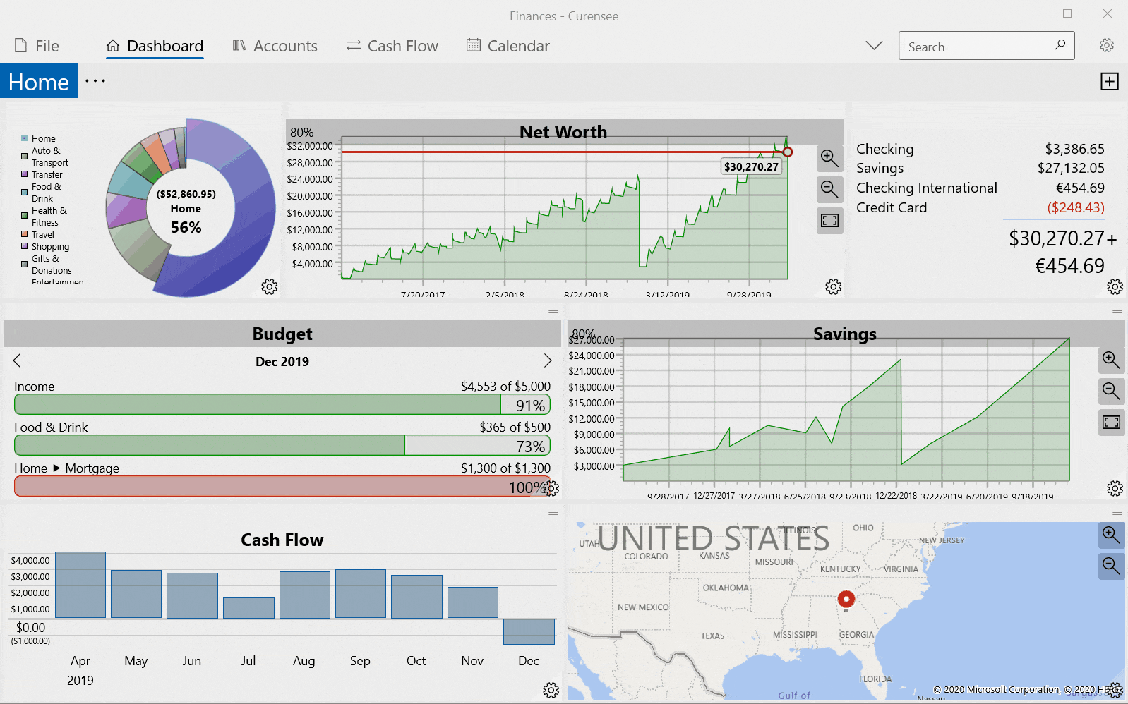
The Dashboard view is dominated by the dashboard itself taking up the majority of the available space. The dashboard will display all widgets in the currently selected page. Fig. 3.1 below shows an example of dashboard view with the default layout. The ‘Home’ page is selected and there are no other pages. The dashboard has seven widgets including a pie chart, net worth, balance, budget, cash flow, etc.
|
|---|

Fig. 3.1 Default Layout¶ |
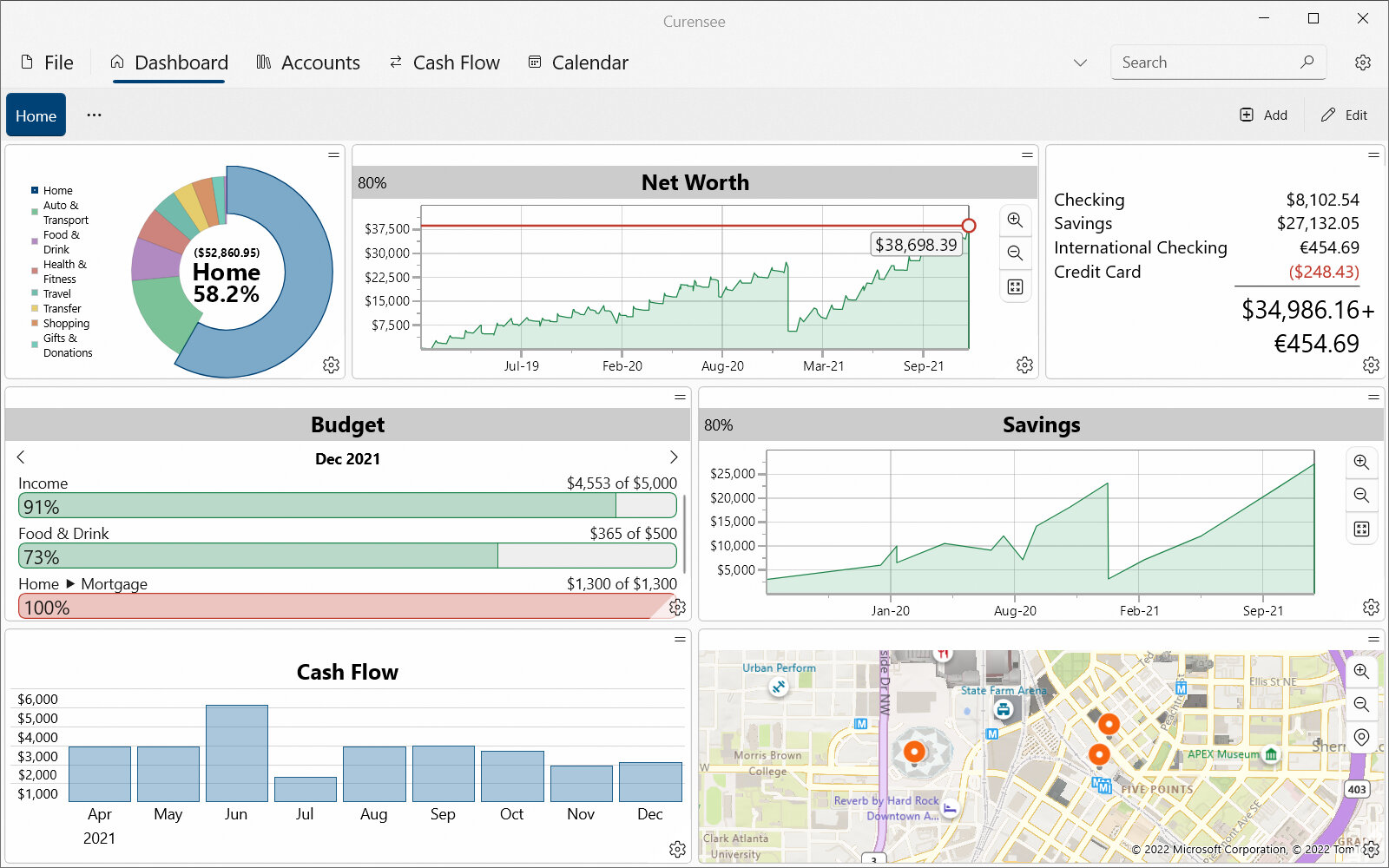
At the very top of the dashboard view, above the main content area, is the command bar. The command bar contains actions useful when working with the dashboard. On the far right-side of the command bar is the Edit button (which is available in most views). Pressing this button will open the edit menu which allows for editing accounts, reminders, fields and other primary data. For further information see Command Bar Actions in Actions.
On the left-side of the command bar shown in Fig. 3.1 are the buttons Home, which is the only page in the dashboard in this example, and … which opens the Dashboard page menu (see actions below for more details). If other pages exist in the dashboard they will appear next to the Home page.
Note
The ‘Home’ page is just an example. This dashboard page can be renamed as desired.
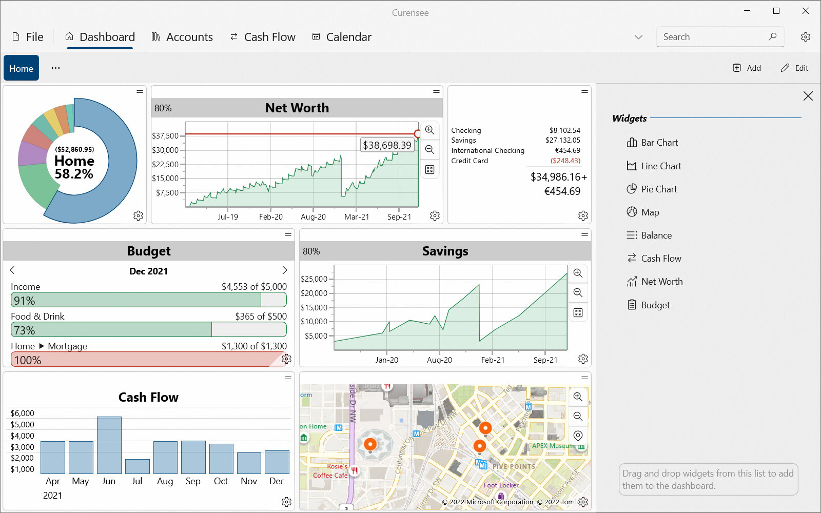
On the right-side of the command bar is the  Add button. Pressing this button will open the add widget side pane. An example of this side pane is shown below in Fig. 3.2. The side pane contains a list of all widgets that can be added to the dashboard. To add a widget, drag and drop it from the list into the desired position on the dashboard. For further instructions see Add widget side pane in Actions and the Adding a New Widget section.
|
|---|
|
Fig. 3.2 Add widget side pane¶ |
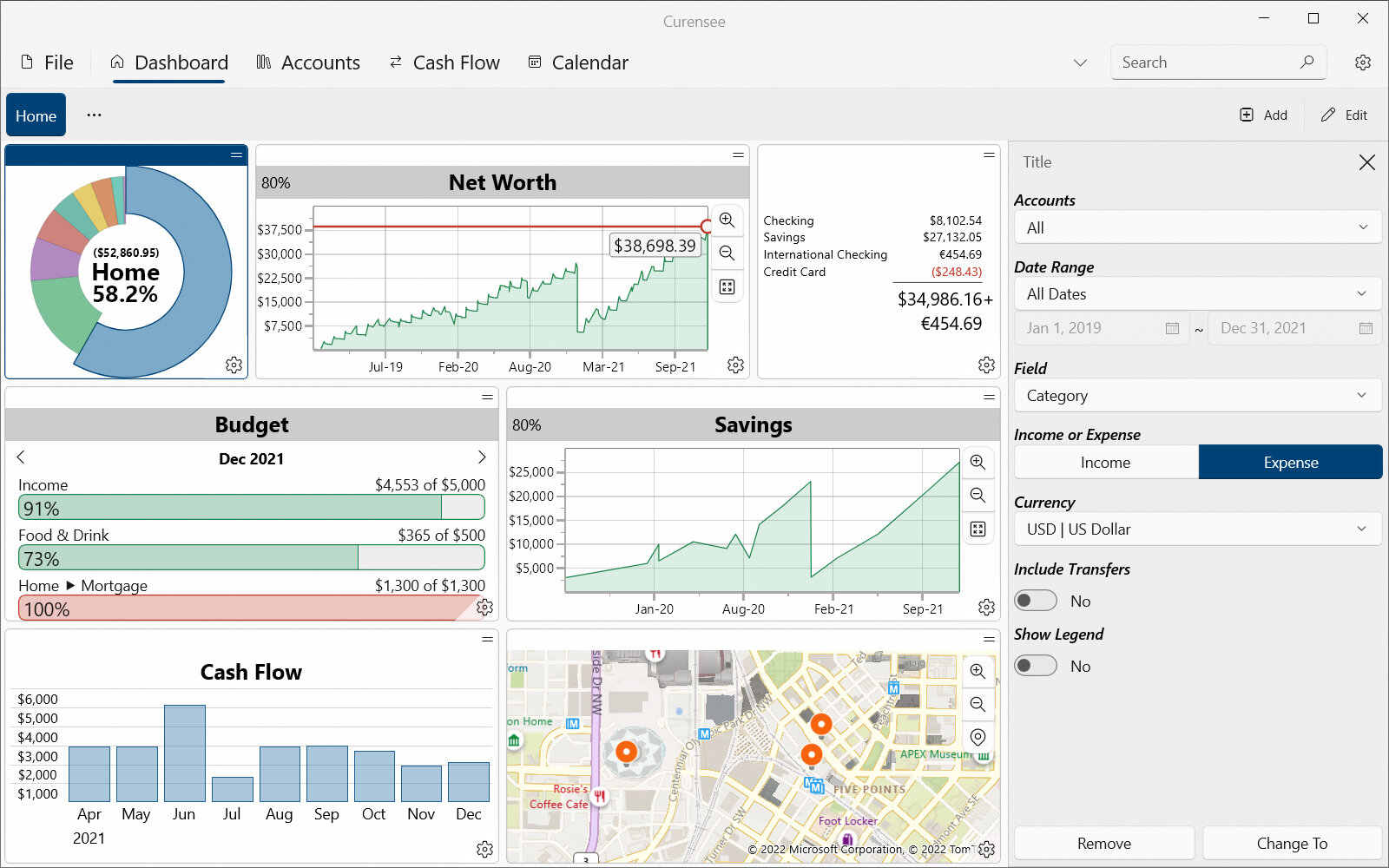
Widgets can be selected within a page. To select a widget, either press  in the bottom right corner or double press the header (where the title is displayed).
Once a widget is selected, the Widget settings side pane will open. An example of the Widget settings side pane is shown below in Fig. 3.3. For further instructions on how to use this side pane see Widget settings side pane in Actions and the settings for the selected widget type in Widgets.
Selected widgets can also be resized and moved within the dashboard.
|
|---|
|
Fig. 3.3 Widget settings side pane¶ |
3.2. Actions
This view has the following actions. These actions are accessible from both the top command bar just below the view tabs as well as in the dashboard itself.
3.2.1. Command Bar Actions
Attention
Some or all of this functionality may not be available on certain platforms or may require an additional feature upgrade. Feature upgrades are available as in-app purchases on supported platforms.
Icon |
Action |
Description |
|---|---|---|
|
Open Dashboard Page Menu |
Opens the dashboard page menu. This menu includes actions to manage all pages in the dashboard. See the Dashboard page menu section for more details. |
|
Add Dashboard Widget |
Opens the side pane of available widgets. Widgets from this list can be dragged onto the dashboard to add a new widget. See the Add widget side pane and Adding a New Widget sections for more details. |
|
Edit |
Opens the Edit Menu. See the Edit Menu section below for more details. |
Edit Menu |
||
|
Accounts |
Opens the accounts editor. See the Accounts Editor section for more details. |
|
Budgets |
Opens the budgets editor. See the Budgets Editor section for more details. |
|
Reminders |
Opens the reminders editor. See the Reminders Editor section for more details. |
|
Fields |
Opens the transaction field definitions editor. See the Field Definitions Editor section for more details. |
|
Transaction Templates |
Opens the transaction templates editor. See the Transaction Templates Editor section for more details. |
Dashboard page menu |
||
|
Add Page |
Adds a new dashboard page to the dashboard. A default name will be given. |
|
Remove Page |
Removes the selected dashboard page. A warning will appear before removing the page. |
|
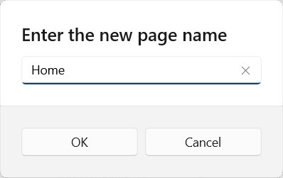
Rename Page |
Opens an editor to rename the selected dashboard page. Any name can be used, even a duplicate with another page.
|
|
Clear Page |
Clears all widgets in the currently selected page. A warning will appear before removing all widgets. |
|
Page Layout |
Opens the menu of pre-defined dashboard page layouts that can be applied. These layouts will add and configure all widgets in the page. Any existing widgets will be removed. |
Add widget side pane |
||
Widget Drag & Drop |
New widgets can be added to the dashboard by dragging and dropping them from the side pane. See the Adding a New Widget section for more details. |
|


3.2.2. Interactive Actions
The following actions are available when interacting with the dashboard.
Icon |
Action |
Description |
|---|---|---|
Select Dashboard Page |
Pressing on a page title will select it. The selected page contains all widgets visible in the dashboard. |
|
Select Dashboard Widget |
Pressing on the widget header or settings button will select it. Once selected its possible to: |
|
Widget settings side pane |
||
Title |
Sets the title of the widget to display in the dashboard. |
|
Close |
Closes the Widget settings side pane and clears the selection in the dashboard. |
|
Remove |
Removes the widget from the dashboard. Surrounding widgets will automatically resize to fill empty space. A warning will appear before removing. |
|
Change To |
Replaces the widget with one of another type. The existing size and position will be preserved. For example, this can be used to switch a widget from a pie chart to a line chart. |
|
3.2.3. Adding a New Widget
To add a new widget to the selected page:
Press
Once the add widget side pane is open, press and hold the widget to add and drag it onto the dashboard.
The dashboard will update with a live preview of the new widget’s position. Once the widget is in the desired position, drop it to complete adding it to the dashboard.
See Fig. 3.4 for an animation of this process.
Newly added widgets will be given some default settings. These settings are enough for a visual result to be displayed but are likely not the desired view. For information on how to customize widget settings please see Widgets and the settings section corresponding to the type of new widget.
|
|---|
|
Fig. 3.4 Adding a widget example¶ |
3.2.4. Resizing a Widget
To resize a widget:
Select the widget by double pressing its header (where the title is shown) or pressing
Hover the pointer over the edge of the selected widget. The pointer should be over the center of the edge and a resize indicator will appear.
Press and hold the resize indicator (⯇, ⯅, ⯈ or ⯆) and drag the edge to resize it
Note
It is not possible to resize a widget if another would be removed. This restricts how far edges can be resized.
See Fig. 3.5 for an animation of this process.
|
|---|
|
Fig. 3.5 Resizing a widget example¶ |
3.2.5. Moving a Widget
To move a widget:
Press and hold the header of the widget (where the title is shown). It is not necessary to first select it. If the widget is selected, make sure to press the header to the side of the top resize indicator.
Drag the widget to move it around the dashboard
The dashboard will update with a live preview of the new position. Once the widget is in the desired position, drop it to complete the move.
See Fig. 3.6 for an animation of this process.
|
|---|
|
Fig. 3.6 Moving a widget example¶ |

3.3. Widgets
As explained above, the dashboard is composed of several unique widgets. Each of these widgets is listed and explained in the below sections.
Hint
Click the desired widget Name in the table below to go to the detailed section.
Icon |
Name |
Example |
|---|---|---|
|
|
|
|
|
|
|
|
|
|
|
|
|
|
|
|
|
|
|
|
|
|
|


Note
Each widget has a list of settings accessible by pressing in the bottom right corner of each widget. Several widgets share similar settings. See each section for further details on settings.
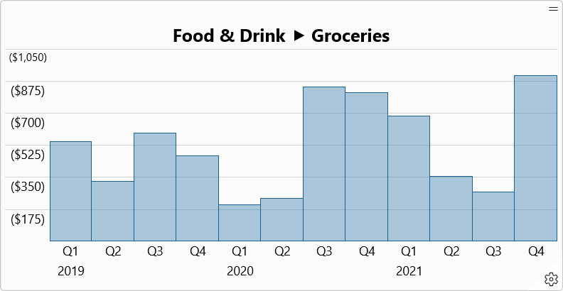
3.3.1. Bar Chart
A Bar Chart widget, shown in Fig. 3.7, displays total amounts, grouped by period, over time. The total amount is calculated from all transactions that match the selected field data (usually a specific category or payee).
The vertical axis represents the total amount of all matching transactions within a time period. The horizontal axis represents time grouped by period. The title of the chart is the selected field data.
Examples of things this widget is useful to show include:
The amount spent on groceries every month for the past year
The amount paid to a specific payee, such as your landlord, every year
|
|---|
|
Fig. 3.7 Example of a Bar Chart widget¶ |
3.3.1.1. Actions
A Bar Chart widget has the following actions. Each of these actions can be invoked by interacting with the displayed widget in the dashboard.
Icon |
Action |
Description |
|---|---|---|
|
Settings |
Opens the settings for the widget. For more details see the next section. |
Select Bar Item |
A bar item can be selected in the chart to display the exact amount for the selected time period. |
3.3.1.2. Settings
A Bar Chart widget has the settings shown in Fig. 3.8.
|
|---|
|
Fig. 3.8 Bar Chart Settings¶ |
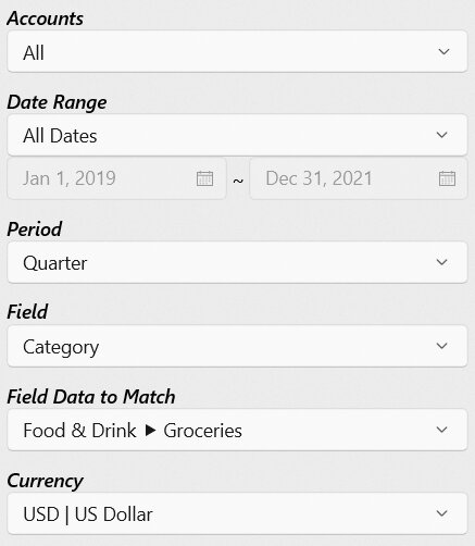
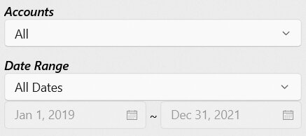
- Accounts
Specifies one or more accounts to use in the calculation and results. Only transactions or splits within the specified accounts are included. For further details on how to select multiple accounts see Selection Box.
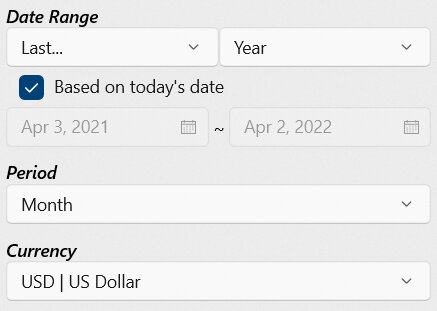
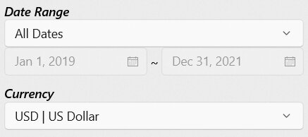
- Date Range
Specifies the range of dates to use in the calculation and/or results. Transactions and splits outside of the specified date range will be excluded. For further details on how to select a date range see Date Range Picker.
- Period
Specifies a period of time used primarily to group results together. The following periods are commonly selectable.
Week : A seven day period
Month : A calendar month with varying days
Quarter : A four month period
Year : A 365-day or 12-month calendar year
Decade : A 10-year period
- Field
Specifies the transaction field to use in the calculation. Only fields with a compatible type are listed.
Note
Only fields that are categorical type will be available for charting. This prevents generating charts where the data is not well grouped which both takes a long time to calculate and produces a messy result. Fields such as ‘memo’, ‘check number’ and ‘description’ don’t make sense in a chart like this. Instead, use fields such as ‘category’ or ‘payee.’
- Field Data to Match
Specifies which field data transactions should be matched against. This list will be automatically generated based on the previous settings. For example, this allows the selection of a specific payee or category.
- Currency
Specifies which currency (by currency code) should be used in the calculation and results. Only currencies that exist in the source transactions are listed.
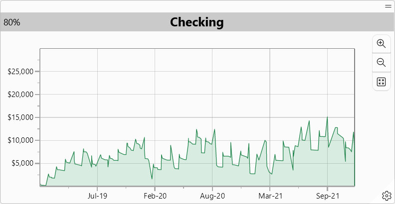
3.3.2. Line Chart
A Line Chart widget, shown in Fig. 3.9, displays the balance in an account over time. The balance is calculated from all transactions in the specified account.
The vertical axis represents the account balance. The horizontal axis represents time. The title of the chart is the account being shown.
Examples of things this widget is useful to show include:
Account balance over time
|
|---|
|
Fig. 3.9 Example of a Line Chart widget¶ |
Hint
This chart is highly interactive with panning, zooming and pointer/cursor position guides supported. This allows the user to isolate and view smaller details on a per-transaction basis. If markers are enabled, it’s also possible to press a marked point on the chart to open the corresponding transaction. See the actions section for more detail.
3.3.2.1. Actions
A Line Chart widget has the following actions. Each of these actions can be invoked by interacting with the displayed widget in the dashboard.
Icon |
Action |
Description |
|---|---|---|
|
Zoom In |
Zooms in on the chart. This is useful to see more finite details. |
|
Zoom Out |
Zooms out on the chart. This is useful to get a broader understanding of trends. |
|
Fit |
Fits the entire chart into view. |
|
Settings |
Opens the settings for the widget. For more details see the next section. |
Pointer Move |
Shows a live updating description of the date and amount at the pointer/cursor position on the chart. Guides are shown to better understand position. |
|
Pointer Press & Drag |
Pans the chart. Panning allows moving the chart up, down, left or right. |
|
Mouse Scroll In/Out |
Zooms in or out on the chart at the pointer position. See above for Zoom In and Zoom Out details. |
|
Press Marker |
When markers are enabled in settings (View > Markers On) they can be pressed to open the corresponding transaction. |


3.3.2.2. Settings
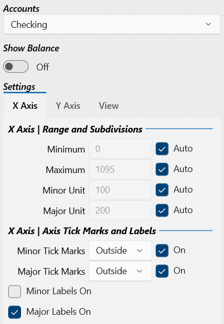
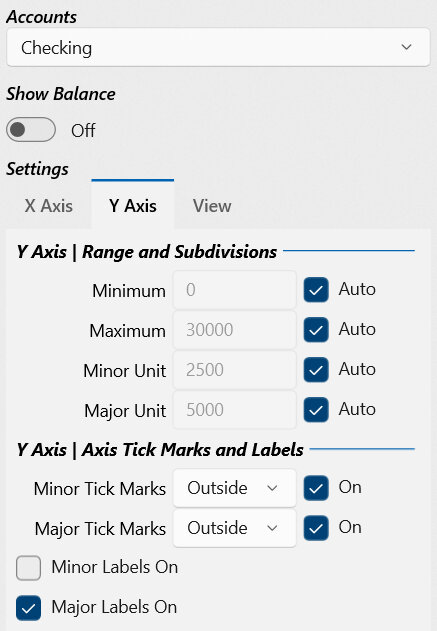
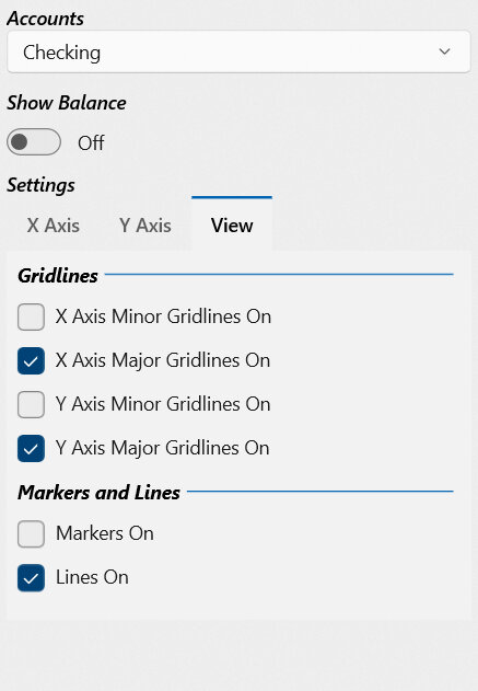
A Line Chart widget has the settings shown in Fig. 3.10. Unlike other widgets, a Line Chart has a group of settings to customize the chart styling. Each of these setting groups can be accessed by pressing the heading: X Axis, Y Axis or View.
|
|
|
|---|---|---|
|
Fig. 3.10 Line Chart Settings¶ |
||
Hint
All setting changes update the chart live. If a setting’s purpose isn’t clear, try modifying it and see how it changes the chart.
- Account
Specifies the account to use in the calculation and results. Only transactions or splits within the specified account are included.
X Axis & Y Axis
The X Axis and Y Axis setting groups contain settings that correspond with either the horizontal X axis or the vertical Y axis respectively.
- Minimum
Specifies the minimum number to view on the chart axis. This will be the smallest value shown.
- Maximum
Specifies the maximum number to view on the chart axis. This will be the largest value shown.
- Minor Unit
The numerical interval between the minor tick marks and gridlines. Multiple minor intervals can occur before the next major interval.
- Major Unit
The numerical interval between the major tick marks and gridlines. Multiple minor intervals can occur before the next major interval.
Note
Minimum, Maximum, Minor Units and Major Units are not always intuitive numbers to modify. For the vertical Y axis, these numbers are more intuitive and represent an amount as a number without currency information. It is easy to set this value. For the horizontal axis, these numbers represent the number of fractional days since the first transaction date – which is difficult to calculate. For this reason it is better to leave these settings as automatically calculated by checking Auto.
- Minor Tick Marks
Specifies whether minor tick marks are shown on the chart (On is checked). If shown, marks can appear to either the inside or outside of the axis. Minor tick marks occur at the minor unit interval.
- Major Tick Marks
Specifies whether major tick marks are shown on the chart (On is checked). If shown, marks can appear to either the inside or outside of the axis. Major tick marks occur at the major unit interval.
- Minor Labels On
Whether minor labels are shown on the chart. Minor labels interpret the numerical value on an axis as either a currency amount (vertical Y axis) or a date (horizontal X axis).
- Major Labels On
Whether major labels are shown on the chart. Major labels interpret the numerical value on an axis as either a currency amount (vertical Y axis) or a date (horizontal X axis). Labels are important to understanding this chart and the major labels are recommended to always be enabled.
View
The View setting group contains settings that correspond to the chart as a whole instead of a particular axis.
- X Axis Minor Gridlines On
Whether minor gridlines are shown on the horizontal X axis. Multiple minor gridlines can occur before the next major gridline.
- X Axis Major Gridlines On
Whether major gridlines are shown on the horizontal X axis. Multiple minor gridlines can occur before the next major gridline.
- Y Axis Minor Gridlines On
Whether minor gridlines are shown on the vertical Y axis. Multiple minor gridlines can occur before the next major gridline.
- Y Axis Major Gridlines On
Whether major gridlines are shown on the vertical Y axis. Multiple minor gridlines can occur before the next major gridline.
- Markers On
Whether a marker is shown for each point on the chart. A marked point represents a single transaction and can be pressed to open the corresponding transaction.
- Lines On
Whether the line connecting all markers is shown on the chart. It is highly recommended to always keep this enabled or the chart will be either difficult to interpret or not visible.
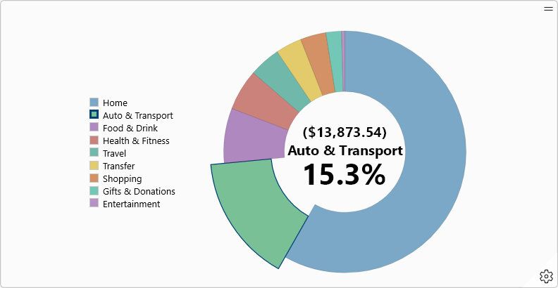
3.3.3. Pie Chart
A Pie Chart widget, shown in Fig. 3.11, displays the total sum of all transactions with the same field data as a slice of the overall whole. Unique field data values are shown as separate slices on the chart.
The pie chart is divided into several individual slices. Each pie slice represents an amount and percentage of the whole ‘pie’. A pie slice is created for each unique value being displayed (commonly different categories or payees).
Importantly, each pie slice can itself be made up of smaller slices. Double pressing a pie slice will expand the slice and show how it is subdivided. The expanded pie slice will then become the title of the chart with an option to go back. For more details see the actions section.
Examples of things this widget is useful to show include:
Amount spent on all categories in a month
Amount spent on all ‘food & drink’ subcategories in a year
Amount spent on all payees in a quarter
Amount saved in all categories
Total credit/income from all payees
|
|---|
|
Fig. 3.11 Example of a Pie Chart widget¶ |
Note
The pie chart will only show up to 10 unique pie slices. Any additional slices will be grouped together in an ‘other’ slice. This is to make the chart more readable and improve application performance.
3.3.3.1. Actions
A Pie Chart widget has the following actions. Each of these actions can be invoked by interacting with the displayed widget in the dashboard.
Icon |
Action |
Description |
|---|---|---|
|
Go Back |
Goes back one level in the pie chart. This is only visible when a pie slice has been expanded to see how it is subdivided. The previous slice will be shown as the title of the chart when this action is available. |
|
Settings |
Opens the settings for the widget. For more details see the next section. |
Select Pie Slice |
A pie slice can be selected in the chart to show its amount, percentage of whole and name. This information is shown in the center of the pie chart. Selected pie slices will be visibly ‘pulled out’ and separate from other slices. |
|
Double Press Pie Slice |
A selected pie slice can be double pressed in the chart. If that pie slice is further divided into smaller slices, the slice will be expanded and all subdividing slices will be shown. The title of the chart will be the expanded slice and the option to ‘Go Back’ will appear. For example, this is useful to expand category ‘food & drink’ into all its subdivisions including ‘groceries’, ‘restaurants’, etc. |
|
Press Legend Item |
Selects the pie slice corresponding with the legend item. |

3.3.3.2. Settings
A Pie Chart widget has the settings shown in Fig. 3.12.
|
|---|
|
Fig. 3.12 Pie Chart Settings¶ |
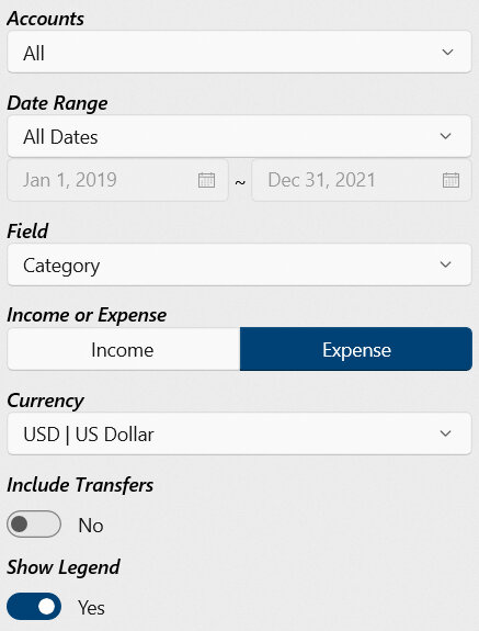
- Accounts
Specifies one or more accounts to use in the calculation and results. Only transactions or splits within the specified accounts are included. For further details on how to select multiple accounts see Selection Box.
- Date Range
Specifies the range of dates to use in the calculation and/or results. Transactions and splits outside of the specified date range will be excluded. For further details on how to select a date range see Date Range Picker.
- Field
Specifies the transaction field to use in the calculation. Only fields with a compatible type are listed.
Note
Only fields that are categorical type will be available for charting. This prevents generating charts where the data is not well grouped which both takes a long time to calculate and produces a messy result. Fields such as ‘memo’, ‘check number’ and ‘description’ don’t make sense in a chart like this. Instead, use fields such as ‘category’ or ‘payee.’
- Income or Expense
Whether the chart should include only income or expense amounts. Due to the nature of this chart, positive (income) and negative (expense) amounts must be shown separately.
Income : Includes only income (positive) amounts.
Expense [Default] : Includes only expense (negative) amounts.
- Currency
Specifies which currency (by currency code) should be used in the calculation and results. Only currencies that exist in the source transactions are listed.
- Include Transfers
Specifies whether transactions that are linked with another transaction as a transfer should be included in the calculation and results. See Transfers for further details.
- Show Legend
Whether a legend should be included next to the chart. The legend will include the name and color of each pie slice in the chart. Legend entries can also be pressed to select the corresponding pie slice.
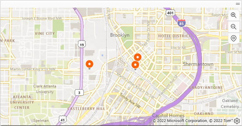
3.3.4. Map
A Map widget, shown in Fig. 3.13, displays the geographic location information of transactions on a map.
Examples of things this widget is useful to show include:
Showing where all transactions have occurred on a map
Showing where transactions have ocurred within the last year
Attention
Transactions will only appear on the map if they have latitude and longitude coordinates (GeoPosition type) in one of the fields. At this time, an address alone is not sufficient to include a transaction on the chart.
|
|---|
|
Fig. 3.13 Example of a Map widget¶ |
Hint
This chart is highly interactive with panning, zooming and pointer/cursor position guides supported. This allows the user to isolate and view smaller details on a per-transaction basis. It’s also possible to press a pin on the map to open the corresponding transaction. See the actions section for more details.
3.3.4.1. Actions
A Map widget has the following actions. Each of these actions can be invoked by interacting with the displayed widget in the dashboard.
Icon |
Action |
Description |
|---|---|---|
|
Zoom In |
Zooms in on the chart. This is useful to see more finite details. |
|
Zoom Out |
Zooms out on the chart. This is useful to get a broader understanding of trends. |
|
Recenter |
Recenters the map around the most prominent locations. This will not change the zoom level. |
|
Settings |
Opens the settings for the widget. For more details see the next section. |
Press Pin |
Map pins can be pressed to open the corresponding transaction. |

3.3.4.2. Settings
A Map widget has the settings shown in Fig. 3.14.
|
|---|
|
Fig. 3.14 Map Settings¶ |
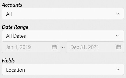
- Accounts
Specifies one or more accounts to use in the calculation and results. Only transactions or splits within the specified accounts are included. For further details on how to select multiple accounts see Selection Box.
- Date Range
Specifies the range of dates to use in the calculation and/or results. Transactions and splits outside of the specified date range will be excluded. For further details on how to select a date range see Date Range Picker.
- Fields
Specifies one or more transaction fields to use in the calculation. Only fields with a compatible type are listed. For further details on how to select multiple fields see Selection Box.
Note
Only fields that are location type, including Address and GeoPosition field data types, will be available for charting.
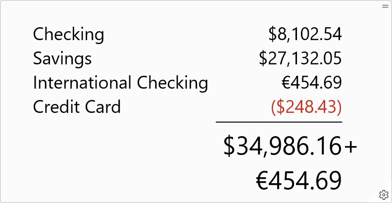
3.3.5. Balance
A Balance widget, shown in Fig. 3.15, displays the total balance of one or more accounts over a defined date range.
Examples of things this widget is useful to show include:
The total balance/value of all accounts
The total change in value of all accounts over the last month
The total balance/value of specific accounts such as savings
|
|---|
|
Fig. 3.15 Example of a Balance widget¶ |
3.3.5.1. Actions
A Balance widget has the following actions. Each of these actions can be invoked by interacting with the displayed widget in the dashboard.
Icon |
Action |
Description |
|---|---|---|
|
Settings |
Opens the settings for the widget. For more details see the next section. |
Note
Balance has no actions other than the standard Settings button.
3.3.5.2. Settings
A Balance widget has the settings shown in Fig. 3.16.
|
|---|
|
Fig. 3.16 Balance Settings¶ |
- Accounts
Specifies one or more accounts to use in the calculation and results. Only transactions or splits within the specified accounts are included. For further details on how to select multiple accounts see Selection Box.
- Date Range
Specifies the range of dates to use in the calculation and/or results. Transactions and splits outside of the specified date range will be excluded. For further details on how to select a date range see Date Range Picker.
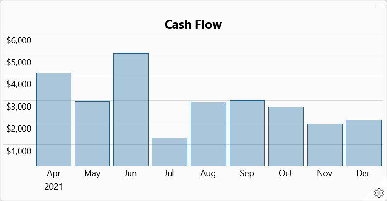
3.3.6. Cash Flow
A Cash Flow widget, shown in Fig. 3.17, displays the total amount of all assets less the total value of all liabilities, grouped by period, over time. In other words, it displays the total sum of all transactions grouped by time period.
The vertical axis in the chart represents the total amount within the time period. The horizontal axis represents time grouped by period.
Examples of things this widget is useful to show include:
The net amount spent or saved each month over the last year
The net amount spent or saved each year over the last decade
|
|---|
|
Fig. 3.17 Example of a Cash Flow widget¶ |
3.3.6.1. Actions
A Cash Flow widget has the following actions. Each of these actions can be invoked by interacting with the displayed widget in the dashboard.
Icon |
Action |
Description |
|---|---|---|
|
Settings |
Opens the settings for the widget. For more details see the next section. |
Select Bar Item |
A bar item can be selected in the chart to display the amount for the selected time period. |
3.3.6.2. Settings
A Cash Flow widget has the settings shown in Fig. 3.18.
|
|---|
|
Fig. 3.18 Cash Flow Settings¶ |
- Date Range
Specifies the range of dates to use in the calculation and/or results. Transactions and splits outside of the specified date range will be excluded. For further details on how to select a date range see Date Range Picker.
- Period
Specifies a period of time used primarily to group results together.
- Currency
Specifies which currency (by currency code) should be used in the calculation and results. Only currencies that exist in the source transactions are listed.
3.3.7. Net Worth
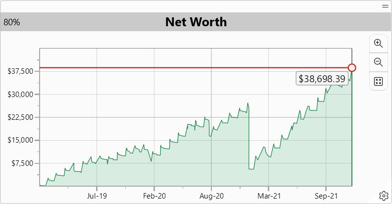
A Net Worth widget, shown in Fig. 3.19, displays the total value of all assets less the total value of all liabilities over time. In other words, it displays the total sum of all transactions over time.
The vertical axis represents the total net worth. The horizontal axis represents time. A horizontal line is drawn to indicate the current net worth (at the time of the last transaction). The net worth amount is shown under this line.
Examples of things this widget is useful to show include:
The total value of all accounts in a visual form (as compared to Balance)
Cash flow in the broadest possible way to understand if it is trending up or down
|
|---|
|
Fig. 3.19 Example of a Net Worth widget¶ |
Hint
This chart is highly interactive with panning, zooming and pointer/cursor position guides supported. This allows the user to isolate and view smaller details on a per-transaction basis. See the actions section for more detail.
3.3.7.1. Actions
A Net Worth widget has the following actions. Each of these actions can be invoked by interacting with the displayed widget in the dashboard.
Icon |
Action |
Description |
|---|---|---|
|
Zoom In |
Zooms in on the chart. This is useful to see more finite details. |
|
Zoom Out |
Zooms out on the chart. This is useful to get a broader understanding of trends. |
|
Fit |
Fits the entire chart into view. |
|
Settings |
Opens the settings for the widget. For more details see the next section. |
Pointer Move |
Shows a live updating description of the date and amount at the pointer/cursor position on the chart. Guides are shown to better understand position. |
|
Pointer Press & Drag |
Pans the chart. Panning allows moving the chart up, down, left or right. |
|
Mouse Scroll In/Out |
Zooms in or out on the chart at the pointer position. See above for Zoom In and Zoom Out details. |
3.3.7.2. Settings
A Net Worth widget has the settings shown in Fig. 3.20.
|
|---|
|
Fig. 3.20 Net Worth Settings¶ |
- Date Range
Specifies the range of dates to use in the calculation and/or results. Transactions and splits outside of the specified date range will be excluded. For further details on how to select a date range see Date Range Picker.
Note
Unlike other widgets, all transactions will be used in the net worth calculation regardless of selected date range. However, only dates within the specified range will be shown. This is necessary for the net worth calculation to be accurate.
- Currency
Specifies which currency (by currency code) should be used in the calculation and results. Only currencies that exist in the source transactions are listed.
3.3.8. Budget
Attention
Some or all of this functionality may not be available on certain platforms or may require an additional feature upgrade. Feature upgrades are available as in-app purchases on supported platforms.
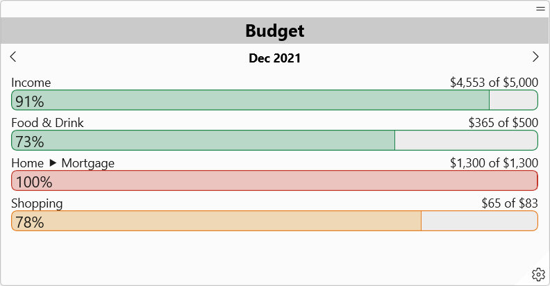
A Budget widget, shown in Fig. 3.21, displays the progress made towards completing a budget in a specified time period. A budget is a list of goals that can be either spending (expense) or saving (income). Progress made towards completing a goal is indicated by both an overall percentage (example: 47%) as well as a numerical amount of the total (example: $235.00 of $500.00). A color is also given to quickly interpret goal progress.
Examples of things this widget is useful to show include:
The progress toward completing your spending budget goals for this month
The progress made toward completing your savings goals last quarter
See Budgets Editor for more information on creating or editing budgets and goals.
|
|---|
|
Fig. 3.21 Example of a Budget widget¶ |
The color of the progress bar changes based on the goal completion percentage. Percentages and their corresponding colors are given in the below table (value represents the goal completion percentage).
Color |
Expense/Spending |
Income/Saving |
|---|---|---|
Red |
value ≥ 90% |
0% < value < 75% |
Yellow |
75% ≤ value < 90% |
75% ≤ value < 90% |
Green |
0% < value < 75% |
value ≥ 90% |
None |
value = 0% |
value = 0% |
Note
The progress made towards completing a budget goal is calculated within a period of time such as month or quarter. This period of time does not need to match with the period used when creating the goal. The conversion between different time periods is done automatically and the goal amount adjusted accordingly.
3.3.8.1. Actions
A Budget widget has the following actions. Each of these actions can be invoked by interacting with the displayed widget in the dashboard.
Icon |
Action |
Description |
|---|---|---|
|
Previous Period |
Moves the displayed budget progress to show the previous period of time. For example, December 2019 will become November 2019 and goal progress recalculated. |
|
Next Period |
Moves the displayed budget progress to show the next period of time. For example, February 2019 will become March 2019 and goal progress recalculated. |
|
Settings |
Opens the settings for the widget. For more details see the next section. |


3.3.8.2. Settings
A Budget widget has the settings shown in Fig. 3.22.
|
|---|
|
Fig. 3.22 Budget Settings¶ |
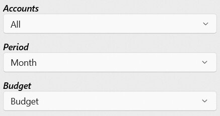
- Accounts
Specifies one or more accounts to use in the calculation and results. Only transactions or splits within the specified accounts are included. For further details on how to select multiple accounts see Selection Box.
- Period
Specifies a period of time used primarily to group results together. By default the period that today is within will be shown first. The user can then move to the next or previous period as desired. The following periods are commonly selectable.
Week : A seven day period
Month : A calendar month with varying days
Quarter : A four month period
Year : A 365-day or 12-month calendar year
Decade : A 10-year period
- Budget
Specifies the budget to show progress for. Each goal within the budget will be shown along with a percent complete indication. See Budgets Editor for more information on creating or editing budgets and goals.