10. Input Controls
This application has many specialized data input controls. These controls are useful to do things such as input a complex currency amount including foreign codes (Currency Box) or specify a range of dates to use in a chart (Date Range Picker). This section describes how to use these specialized input controls.
Note
Some of this content is for advanced users only. It is not necessary to understand all of these sections to use the application. In several cases the use of these controls will be obvious based on context.
10.1. Color Picker
Attention
Some or all of this functionality may not be available on certain platforms or may require an additional feature upgrade. Feature upgrades are available as in-app purchases on supported platforms.
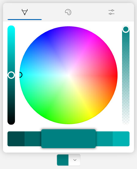
The color picker is used to select a color. It’s possible to select a color visually from a spectrum, from a pre-defined palette or input precise color component values. An example of the color picker in expanded view is shown in Fig. 10.1.
|
|---|

Fig. 10.1 Color picker example¶ |
The color picker has two views:
Collapsed view : Displays only the currently selected color in a drop-down button. This is intended as a quick preview of the selected color when editing isn’t needed. Pressing the control in this view will go to the expanded view.
Expanded view : Shows the color picker popup that allows selecting or editing the precise color in one of three tabs. To save the selected color, and close the expanded view, press anywhere outside of the popup.
The expanded view contains three tabs used to select a color. See below and the next sections for further details.
Spectrum Tab : Allows for quickly selecting a color from an array of similar colors. All colors are supported and selection is highly visual. This is the fastest and preferred method of selecting a color when it doesn’t need to be consistent.
Palette Tab : Allows for quickly selecting a color from a pre-defined grid or ‘palette’ of colors. This is useful to consistently set the same color. The palette colors have also been chosen to match with the overall design of the application.
Components Tab : Allows inputting precise color component values in either RGB or HSV color representation. This is intended primarily for advanced users or those that wish to precisely match an existing color.
Always visible at the bottom of each tab in the expanded view is the color preview palette. The currently selected color is always visible in the center. Similar colors are presented to the left (darker shades) and right (lighter shades) and pressing on any one of them will change the selection to the pressed color.
Note
To clear the selected color, ensure all color component values are set to zero in the Components Tab. This will create an empty color.
10.1.1. Spectrum Tab
The color spectrum tab allows for quickly selecting a color from an array of similar colors. All colors are supported and selection is highly visual. This is the fastest and preferred method of selecting a color when it doesn’t need to be consistent. An example of the spectrum tab is shown in Fig. 10.2.
|
|---|
|
Fig. 10.2 Color picker - Spectrum tab¶ |
The color spectrum is represented as a full rainbow of colors. Pressing anywhere on this spectrum will select the corresponding color. Sliders are also available to adjust the transparency (alpha component) as well as color saturation.
Note
The spectrum uses HSV color representation.
10.1.2. Palette Tab
The color palette tab allows for quickly selecting a color from a pre-defined grid or ‘palette’ of colors. This is useful to consistently set the same color. The palette colors have also been chosen to match with the overall design of the application. An example of the palette tab is shown in Fig. 10.3.
|
|---|
|
Fig. 10.3 Color picker - Palette tab¶ |
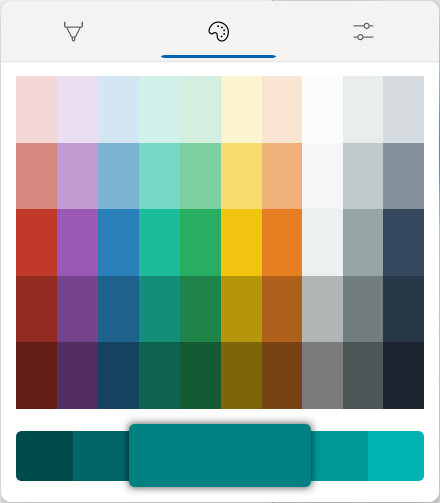
Press on any color within the palette to select it. Each color in the palette is chosen for uniformity with other colors and to provide the most common colors. These pre-defined colors are from Flat UI palette.
Note
Each of the colors in the above palette will have no transparency (100% opacity).
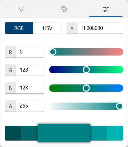
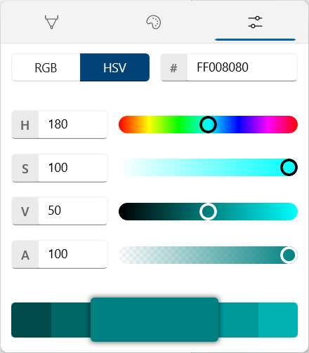
10.1.3. Components Tab
The color components tab allows inputting precise color component values in either RGB (red, green, blue) or HSV (hue, saturation, value) color representation. This is intended primarily for advanced users or those that wish to precisely match an existing color. An example of the components tab is shown in Fig. 10.4.
|
|
|---|---|
|
Fig. 10.4 Color picker - Components tab¶ |
|
Precise color input in the components tab is possible using three methods:
RGB : If RGB color representation is selected, the following components can be edited directly.
Red : The red component of the color. This can be any numerical value between 0 and 255 (8 bits).
Green : The green component of the color. This can be any numerical value between 0 and 255 (8 bits).
Blue : The blue component of the color. This can be any numerical value between 0 and 255 (8 bits).
HSV : If HSV color representation is selected, the following components can be edited directly.
Hue : The hue component is the degree on the color wheel (see the color spectrum). This can be any numerical value between 0 and 360 degrees.
Saturation : The saturation component is the intensity of the color shade from 0% (gray) to 100% (the full color). This can be any numerical value between 0 and 100 percent.
Value : The value is the lightness or brightness of the color from 0% (black) to 100% (the full color). This can be any numerical value between 0 and 100 percent.
HTML Hex Code : A hexadecimal color code (represented by a leading number sign #) followed by the value of the red (RR), green (GG) and blue (BB) components in the format #RRGGBB. All three components are 8 bits and represented in hexadecimal from 0x00 to 0xFF.
Both RGB and HSV components can be adjusted numerically in the input box or visually using the corresponding slider.
10.2. Currency Box
The currency box is used to input advanced amount information where currency code and decimal precision are important. It also supports international currency codes and recording both a local and foreign amount. This control is most commonly used to edit transaction amounts.
The terms Local and Foreign amount are used throughout this section. These terms are defined below.
- Local
The primary currency code and amount. This may also be referred to simply as the amount; a term used throughout the documentation. When entering a single currency amount, this will be a local-only amount. All currencies regardless of type will have a local amount and it is what is used in all calculations. The local currency code commonly matches the account that contains the transaction. Local does not mean the currency code in use where the transaction occurred, it means the currency of the account where it is recorded.
- Foreign
A secondary currency code and amount in a currency different from the local amount. This foreign amount is related to the local amount by the exchange rate. Adding a foreign amount is useful to record both the currency in use where the transaction occurred as well as the amount after posting to your account.
Important
The exchange rate relates the local currency amount with the foreign amount as shown below.
Currencies can be input as one of three different types:
Local Amount Only : This is the most basic type of currency amount and it contains only one local amount with its associated currency code. This should be used for the majority of circumstances when there are no international transactions with differing currency codes.
Local & Foreign Amount : This is a more advanced type of currency that records both the local and foreign amounts with different currency codes. This should be used when it is desired to record both the currency amount in use where the transaction occurred and the amount after posting to your account.
Foreign Amount & Exchange Rate : This is also a more advanced type of currency that records both the local and foreign amounts with different currency codes. However, instead of entering in the local amount, provide the foreign amount as well as the exchange rate used to calculate the local amount.
An illustration showing how to input an amount for each currency type is shown in Fig. 10.5. This example is from the transaction editor and is typical when creating or modifying a transaction.
|
|---|
|
Fig. 10.5 Example currency box input for each type¶ |
Note
In the Fig. 10.5 example the local currency code is locked to the code of the account. This is typical when editing transactions. In other places where the currency box is used (advanced search, budget editor, etc.) it is possible to change the local currency code.
Important
Expenses/spending are indicated by negative amounts and require a negative − sign for the amount. Income/savings are indicated by a positive amount and require a plus + sign for the amount. It is important to set this sign at the beginning of the amount. To make this visually easier to distinguish, negative signs are red. Generally, most transactions are expenses with a negative − sign for the amount.
For more details on each currency type please see the following sections.
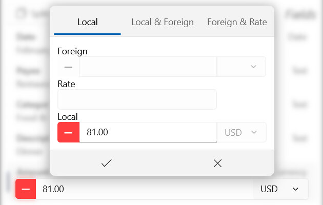
10.2.1. Local Amount Only
This is the most basic type of currency amount and it contains only one local amount with its associated currency code. This should be used for the majority of circumstances when there are no international transactions with differing currency codes.
There are two ways to input a local-only amount:
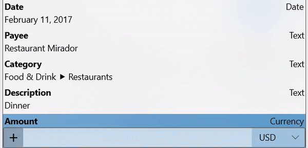
The first method using the inline editor, shown in Fig. 10.6, allows entering the amount directly in the currency box. The income/expense sign must then be set and, when enabled, the currency code.
Hint
Remember the currency code is not modifiable when editing a transaction within an account - it will use the currency code of the account itself.
|
|---|
|
Fig. 10.6 Local amount only currency box - inline editor¶ |
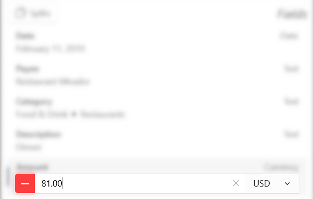
The second method of inputting a local-only amount using the advanced popup editor is shown in Fig. 10.6.
Press ˅ at the far right of the inline currency box to open the advanced popup editor. Within this popup ensure type Local is selected. Then input the amount, income/expense sign and currency code as explained above. When finished, press ✓ to save your changes. Pressing ✕ will cancel the changes and close the popup.
|
|---|
|
Fig. 10.7 Local amount only currency box - popup editor¶ |
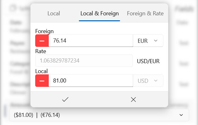
10.2.2. Local & Foreign Amount
This is a more advanced type of currency that records both the local and foreign amounts with different currency codes. This should be used when it is desired to record both the currency amount in use where the transaction occurred and the amount after posting to your account.
Press ˅ at the far right of the inline currency box to open the advanced popup editor (editing this type inline is not possible). Within this popup ensure type Local & Foreign is selected. Then input the amount, income/expense sign and currency code for both the local and foreign amounts. Note that the sign must always match between the foreign and local amounts. The exchange rate will be automatically calculated and displayed. When finished, press ✓ to save your changes. Pressing ✕ will cancel the changes and close the popup.
|
|---|
|
Fig. 10.8 Local & foreign amount currency box¶ |
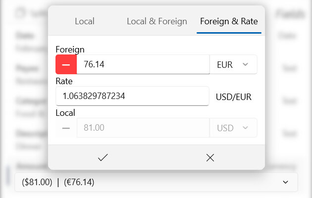
10.2.3. Foreign Amount & Exchange Rate
This is also a more advanced type of currency that records both the local and foreign amounts with different currency codes. However, instead of entering in the local amount, provide the foreign amount as well as the exchange rate used to calculate the local amount.
Press ˅ at the far right of the inline currency box to open the advanced popup editor (editing this type inline is not possible). Within this popup ensure type Foreign & Rate is selected. Then input the amount, income/expense sign and currency code for the foreign amount. Next, enter the exchange rate used to calculate the local amount. The local amount will be automatically calculated and displayed. When finished, press ✓ to save your changes. Pressing ✕ will cancel the changes and close the popup.
|
|---|
|
Fig. 10.9 Foreign amount & exchange rate currency box¶ |
10.3. Date Range Picker
The date range picker is used to define both a start and end date. These start and end dates are then commonly used in calculations where only transactions that occur within the range are used. Most of the time it is not necessary to select both the start and end date directly. Instead, the picker can automatically calculate dates for last year, this month, etc.
Note
Both the start and end dates (whether automatically calculated or specified by the user) are inclusive in calculations. This means a transaction that occurs on either the start or end date (or any date in between) will be included.
The default date range picker is shown in Fig. 10.10. At the top, you can choose the type of the date range (by default All Dates). Generally, this specifies if you would like to input the start and end dates or if they should be automatically calculated – and if so for what time period. Below the range type, both the start and end dates are shown. These dates are only editable if they are not being automatically calculated.
|
|---|
|
Fig. 10.10 Date range picker - All Dates¶ |
The following date range types are supported:
All Dates (Automatic section) : All available dates will be used for the range. In most cases this will use the earliest and latest transaction dates for the selected account(s).
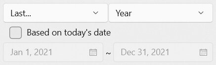
Last… (Automatic section) : The date range will be automatically calculated from today’s date for the last specified time period (see below).
This… (Automatic section) : The date range will be automatically calculated from today’s date for the specified time period (see below).
Beginning On (Custom section) : Only the start date can be specified by the user. The end date will be automatically calculated (usually from the latest transaction date in the selected account(s)).
Ending On (Custom section) : Only the end date can be specified by the user. The start date will be automatically calculated (usually from the earliest transaction date in the selected account(s)).
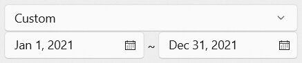
Custom (Custom section) : Both the start and end dates can be be specified by the user.
10.3.1. Automatically Calculated Dates
When either All Dates, Last… or This… range type is selected, both the start and end dates will be automatically calculated. Additionally, when the range type is Last… or Next…, a time period can be specified along with whether that period should start from today’s date.
The following time periods are selectable for the Last… and This… range types.
Week : A seven day period
Month : A calendar month with varying days
Quarter : A four month period
Year : A 365-day or 12-month calendar year
Decade : A 10-year period
An example of automatic date range calculation is shown in Fig. 10.11. If the current date is April 9, 2020, and the date range type is “Last Year”, the start date will be January 1, 2019 and the end date December 31, 2019 assuming Based on today’s date is unchecked. If Based on today’s date is checked, the start date will be April 10, 2020 and the end date April 9, 2020.
|
|---|
|
Fig. 10.11 Date range picker - Last Year¶ |
Important
The Based on today’s date setting is important when calculating time periods. It is used, for example, to distinguish between ‘Last Month’ and ‘Last Month from Today’.
When Based on today’s date is:
Checked : The start and end dates are calculated using the specified time period aligning to the standard time period interval. For example, if the current date is April 9, 2020 and the time period is “Last Month”, the start date will be March 1, 2020 and the end date will be March 31, 2020.
Not Checked : The start and end dates are calculated using the specified time period from today’s date. For example, if the current date is April 9, 2020 and the time period is “Last Month”, the start date will be March 10, 2020 and the end date will be April 9, 2020.
10.3.2. Custom Defined Dates
When either Custom, Beginning On or Ending on range type is selected, one or both the start and end dates can be user defined.
An example of Custom is shown in Fig. 10.12. Notice that both the start and end dates are now modifiable.
|
|---|
|
Fig. 10.12 Date range picker - Custom date range¶ |
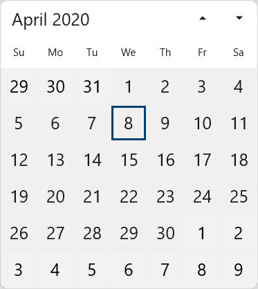
Pressing on a date will open a calendar allowing for a new date to be selected as shown in Fig. 10.13.
Important
Both the start and end dates (whether automatically calculated or specified by the user) are inclusive in calculations. This means a transaction that occurs on either the start or end date (or any date in between) will be included.
|
|---|
|
Fig. 10.13 Selecting a custom date¶ |
Both Beginning On and Ending On range types are similar except only the start or only the end date can be specified. The other date in the range will be automatically calculated (usually from the earliest or latest transaction date in the selected account(s))
10.4. Date & Time Picker
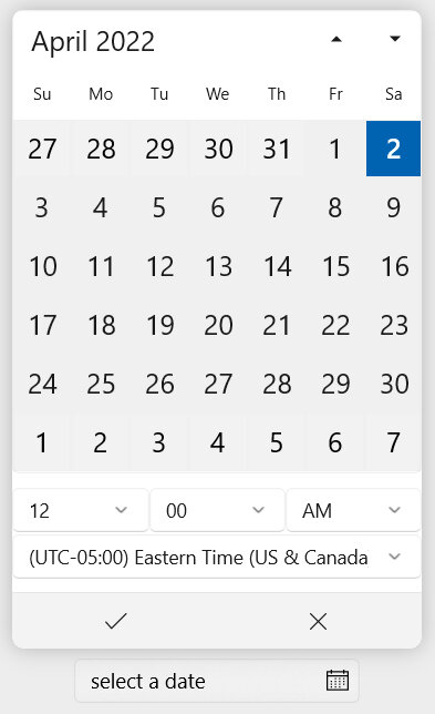
The date and time picker is used to specify a date, time and optionally a timezone. An example of this picker is shown below in Fig. 10.14. By default the picker will show the selected date and time in a button. Pressing this button will open the popup for editing.
|
|---|
|
Fig. 10.14 Date & time picker example¶ |
10.4.1. Date
A calendar will appear at the top of the popup. The date may be selected or modified by pressing any day within the calendar.
Hint
Pressing the ‘Month and Year’ title above the calender once will switch to month view useful to select a month. Pressing again will switch to year view which is useful to select the year. This is useful to quickly select a date in the distant past or future as it avoids scrolling through many months or years.
10.4.2. Time
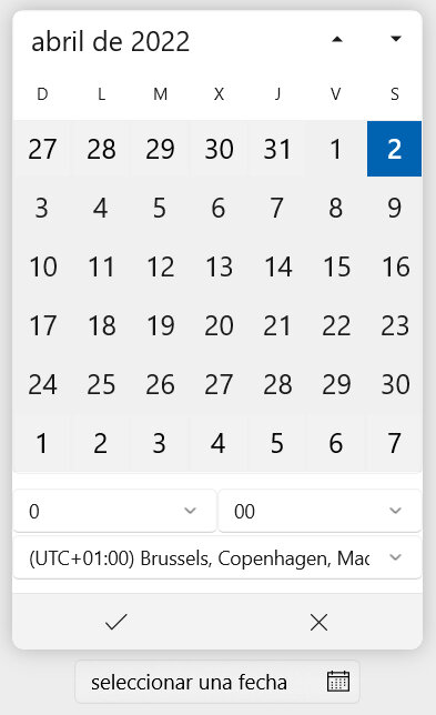
Also within the popup, below the calendar, the time may be selected or modified. Both the hour and minute must be entered separately. For cultures using a 12-hour clock an AM/PM designator will also appear as shown previously in Fig. 10.14. The AM/PM designator will not appear for cultures where a 24-hour clock is standard. An example of a culture using a 24-hour clock is shown in Fig. 10.15.
|
|---|
|
Fig. 10.15 Date & time picker - Spanish, Spain¶ |
Below the hour and minute, the time zone may be specified. This is primarily intended for advanced users and should normally be left with the default value matching your current computer settings.
Time zones available to choose from will follow those defined on your computer. For Windows, supported time zones are documented in this list with the default time zone set based on your country.
10.5. Location Box
The location box is used to define a geographic location anywhere in the world. This location can be defined two ways:
Generally speaking, an address should always be used for the location as it is most easily read and communicated. However, if precise position is required to show on a map, it is also necessary to specify the latitude/longitude coordinates. It is not currently possible to automatically calculate the geographic coordinates from an address (or vice versa).
Note
Both latitude and longitude geographic coordinates must be specified for the location to appear in a Map dashboard item.
An example of both address and latitude/longitude geographic coordinates entered into a location box is shown below in Fig. 10.16. By default the location box shows a simplified preview of the location in a button. Pressing this button will open the popup for editing. Select Address at the top of the popup to modify the address and select GeoPosition to modify latitude/longitude position coordinates (both are further explained in the next sections).
|
|
|---|---|
|
Fig. 10.16 Location box example¶ |
|
Both views have the Open location on the web link. Pressing this will open your default web browser and search for the specified location using an online maps provider. This is helpful to quickly navigate to a location and use it for other purposes outside the application.
Hint
Any location that has exact geographical position coordinates will be indicated by the  symbol. This symbol is visible in the location box even when the popup is closed. It is also commonly visible when viewing transactions themselves.
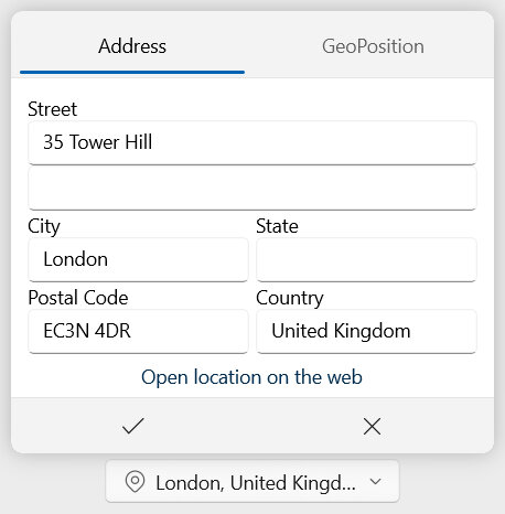
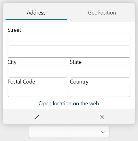
10.5.1. Address
The Address view supports inputting a geographic location in a human-readable localized format. Available fields are shown in Fig. 10.17 and further explained below. The address may be entered in nearly any format even those specific to your country, region or language.
|
|---|
|
Fig. 10.17 Location box - Address¶ |
- Street
The first and second lines of the street address. The first line is commonly the street and number of the building but may also be a company or individual. The second line may include the apartment number.
Note
Both Line 1 and Line 2 of the street address are recommendations. Any content can be supplied here in whichever format makes sense for your country, region or language.
- City
The specific locality - commonly a city - of the address. For locations with more than two localities, this should be the most commonly used name. Other localities can be listed under the street address lines. Possible names for this field include: City, Town, Village, Municipality, Neighborhood or Township.
- State
The geographic region of the address smaller than the country in size but larger than a or city or local region. Possible names for this field include: State, Province, Prefecture or Canton.
- Postal Code
Any alphanumerical code used by the postal service of the country to designate the location of the address. Possible names for this field include: Post code, Postal code or Zip code.
- Country
The country of the address.
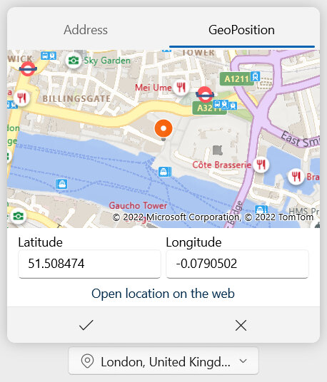
10.5.2. GeoPosition
The GeoPosition view supports inputting a geographic location using latitude and longitude position coordinates. Available fields are shown in Fig. 10.18 and further explained below.
Hint
Double pressing within the map will automatically set the latitude and longitude coordinates to the selected position. It is also possible to paste text formatted as “latitude, longitude” (for example: “51.507372, -0.075764”) in either text box to set both automatically.
|
|---|
|
Fig. 10.18 Location box - GeoPosition¶ |
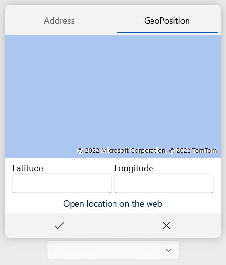
- Latitude
The latitude position coordinate in degrees (North latitude is positive, South is negative). For further details see: https://en.wikipedia.org/wiki/Latitude.
- Longitude
The longitude position coordinate in degrees (East longitude is positive, West is negative). For further details see: https://en.wikipedia.org/wiki/Longitude.
Note
The latitude and longitude position coordinates are accurately stored and displayed with a precision up to six decimal places.
10.6. Schedule Editor
The schedule editor is used to define when an event occurs. The schedule can be a single occurrence or recur multiple times. A schedule is most commonly used when creating reminders.
At minimum, a schedule must have a start date. A schedule with only a start date will occur once. If the scheduled event should occur multiple times, it’s possible to enable a recurrence. A recurrence will repeat following a calculated interval until an end date is reached. The following recurrence types are supported:
None : There is no recurrence. See the No Recurrence section for more details.
Daily : The event will occur daily or after a defined number of days. See the Daily Recurrence section for more details.
Weekly : The event will occur weekly on certain days. See the Weekly Recurrence section for more details.
Monthly : The event will occur monthly on certain days of the month. See the Monthly Recurrence section for more details.
Yearly : The event will occur yearly on a defined day and month. See the Yearly Recurrence section for more details.
A recurrence end date is calculated based on one of three methods:
End on a date : The recurrence will end on the specified date and time.
End after a number of occurrences : The recurrence will end after a specified number of events.
Never end : The recurrence will not end.
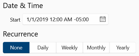
10.6.1. No Recurrence
An example of a non-recurring schedule is shown in Fig. 10.19. Only the start date is selected by choosing a date and time. The recurrence type is set to None. This is the most basic type of schedule.
|
|---|
|
Fig. 10.19 Schedule editor - no recurrence¶ |
10.6.2. Daily Recurrence
An example of a daily recurring schedule is shown in Fig. 10.20. A start date and time must be selected first and the recurrence type set to Daily.
|
|---|
|
Fig. 10.20 Schedule editor - daily recurrence¶ |
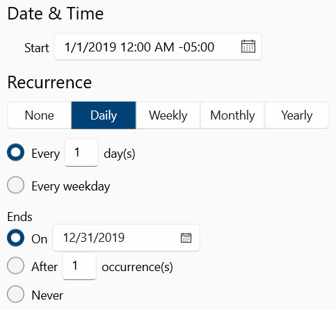
A daily recurrence has the following options:
Every 1 day(s)
Example: Recur every 3 day(s)
The event will occur every N number of days. The number of days between occurrences can be specified.
1 : The interval between daily occurrences. This number must be greater than or equal to one.
Every weekday
Example: Recur every weekday
The event will occur every weekday (Monday through Friday).
10.6.3. Weekly Recurrence
An example of a weekly recurring schedule is shown in Fig. 10.21. A start date and time must be selected first and the recurrence type set to Weekly.
|
|---|
|
Fig. 10.21 Schedule editor - weekly recurrence¶ |
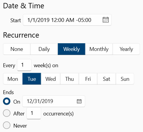
A weekly recurrence has the following options:
Every 1 week(s) on Mon, Tue, Wed, Thu, Fri, Sat, or Sun
Example : Recur every 1 week(s) on Mon, Wed, Fri
The event will occur every N number of weeks on the specified days (Monday through Sunday). The number of weeks between occurrences can be specified. Multiple days of the week for the event to occur on can be selected.
1 : The interval between weekly occurrences. This number must be greater than or equal to one.
Mon : The event will occur on Monday.
Tue : The event will occur on Tuesday.
Wed : The event will occur on Wednesday.
Thu : The event will occur on Thursday.
Fri : The event will occur on Friday.
Sat : The event will occur on Saturday.
Sun : The event will occur on Sunday.
10.6.4. Monthly Recurrence
An example of a monthly recurring schedule is shown in Fig. 10.22. A start date and time must be selected first and the recurrence type set to Monthly.
|
|---|
|
Fig. 10.22 Schedule editor - monthly recurrence¶ |
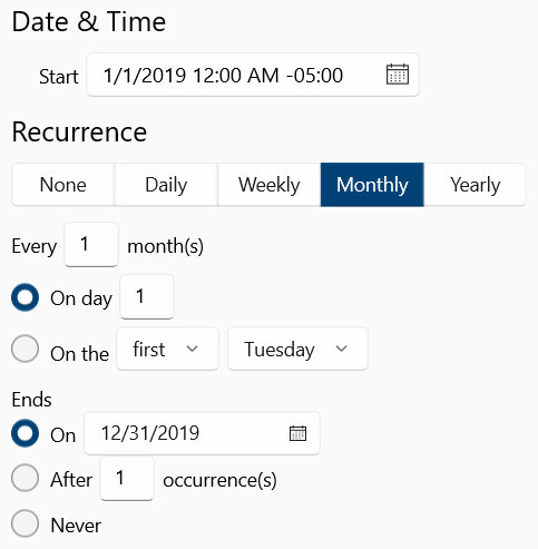
A monthly recurrence has the following options:
Every 1 month(s)
The number of months between occurrences. This will apply along with the next options.
1 : The interval between monthly occurrences. This number must be greater than or equal to one.
On day 1
Example: Recur every 1 month(s) on day 20
The event will occur every N number of months on the specified day of the month (day 1 through day 31 depending on the month). The number of months between occurrences can be specified as described above.
1 : The day of the month the event should occur on. This number must be between 1 and 31.
On the first Monday
Example: Recur every 1 month(s) on the third Wednesday
The event will occur every N number of months on the specified day of the week at the specified occurrence count. The number of months between occurrences can be specified as described above.
first : The occurrence number of the day within the month. This can be set to first, second, third, fourth or last.
Monday : The day of the week the event should occur on. This can be any day Monday through Sunday.
10.6.5. Yearly Recurrence
An example of a yearly recurring schedule is shown in Fig. 10.23. A start date and time must be selected first and the recurrence type set to Yearly.
|
|---|
|
Fig. 10.23 Schedule editor - yearly recurrence¶ |
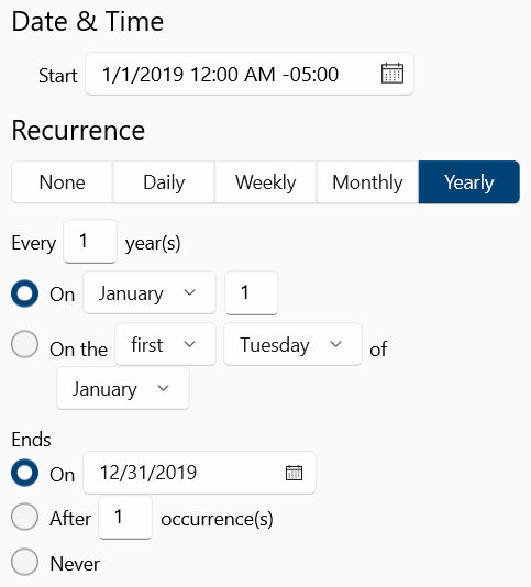
A yearly recurrence has the following options:
Every 1 years(s)
The number of years between occurrences. This will apply along with the next options.
1 : The interval between yearly occurrences. This number must be greater than or equal to one.
On January 1
Example: Recur every 2 year(s) on November 28
The event will occur every N number of years within the specified month on the specified day (day 1 through day 31 depending on the month). The number of years between occurrences can be specified as described above.
January : The month of the year the event should occur within. This can be set to any month.
1 : The day of the month the event should occur on. This number must be between 1 and 31.
On the first Monday of January
Example: Recur every 1 year(s) on the last Wednesday of November
The event will occur every N number of years within the specified month on the specified day of the week and occurrence count. The number of years between occurrences can be specified as described above.
first : The occurrence number of the day within the month. This can be set to first, second, third, fourth or last.
Monday : The day of the week the event should occur on. This can be any day Monday through Sunday.
January : The month of the year the event should occur within. This can be set to any month.
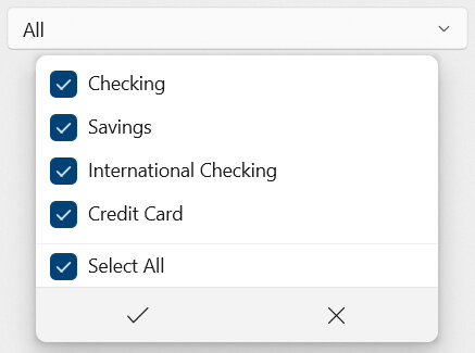
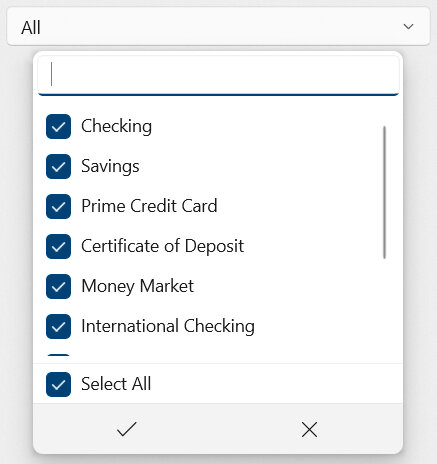
10.7. Selection Box
The selection box is used to select one or more items from a list. The selected items are then commonly used to specify which accounts or fields should be included in calculations (see settings in Widgets) or Search.
An example of a selection box is shown in Fig. 10.24. In this example, the selection box is used to specify which accounts should be included in a calculation and all items are selected.
|
|---|
|
Fig. 10.24 Selection box - all selected¶ |
Note
The appearance of a selection box when the popup is closed may change. In some cases the selection box appears as a button and does not show the selected items. However, when the selection box button is pressed the popup will be opened and appear as described below.
Selected items appear with a check mark ☑ next to the item name. In order to select an item, simply press it. To deselect an item, press it again so an empty box ☐ is shown instead of the check mark. Usually, more than one item may be selected. When finished, press ✓ to save your changes. Pressing ✕ will cancel the changes and close the popup.
Hint
Double pressing an item in the selection box will select only that item and clear other selections. This is useful to save time when only one item out of many needs to be selected.
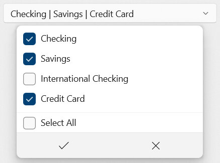
An example of a custom selection (where not all items are selected) is shown in Fig. 10.25. Note that the selection box will display the names of all selected items at the top.
|
|---|
|
Fig. 10.25 Selection box with custom selection¶ |
When more than one selected item is allowed, the selection box has an option at the bottom to quickly Select All. When no selection is allowed, the selection box also has an option to quickly Select None.
10.7.1. Filtering/Search
Where there are many items in the selection box to choose from a text entry box will appear at the top as shown in Fig. 10.26. Typing within this text entry box will filter the items to show matches with the given text. This is similar to searching the list and is very useful to find a specific item.
|
|---|
|
Fig. 10.26 Selection box with filter visible¶ |
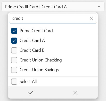
An example of filtering is shown in Fig. 10.27. In this example, only accounts with the text ‘credit’ in their name are shown. This allows for quickly finding and selecting the desired accounts.
Note
Filtering items will not clear any existing selections. It is possible for items to be selected and not shown if they don’t match the filter text. Remember that the selection box will still display the names of all selected items at the top.
|
|---|
|
Fig. 10.27 Selection box with filtering¶ |